Go back
Case
Helan: E-health
Helan customers have lots of useful features at their fingertips, via the app and website. We've explained this before (with a fun animation video of course). But did you know that you can also find tons of useful links and tools in the app and on the website? This is how Helan enables their customers take control of their own health.
The customer
In 2022, Partena and OZ officially merged to form Helan Independent Health Insurance Fund. They became the third-largest health insurance fund in Flanders. Helan also offers home care, child care, housekeeping services, summer camps and a healthcare store.

The challenge
Many people already spend all day looking at a computer screen or a smartphone. If we show them a video with even more screens to look at, we will probably quickly lose their attention. So we need a different way to visualise the functionalities of the app and website.
At the same time, the message has to be clear: Helan makes everything so easy that even technophobic moms can do it.
Our solution
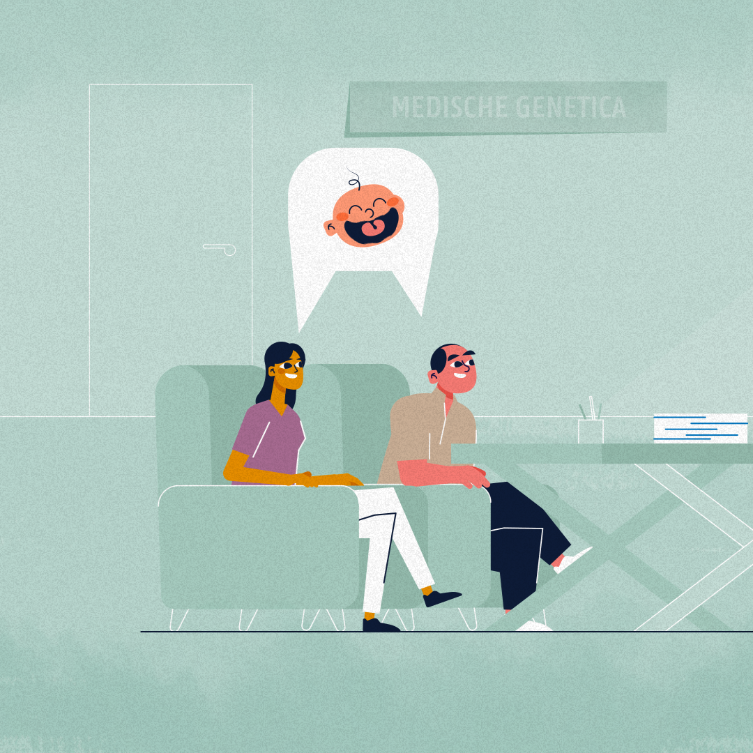
A likeable character with an equally likeable mom. A cosy atmosphere with a little dose of wit here and there. And a clear explanation with supporting visuals. What more could you want?
And finally: who recognises the main character? This friendly mom was also the main character in another video for Helan. She was such a success that we decided to have her return once more. And who knows, maybe we'll see her again in a future video?
Behind the scenes

Script and storyboard
In the good old days, everything was better ... or was it? One thing is sure: our main character does not want to return to the days of closed envelopes. Because today she can take control of her own health, with a little help from Helan.
Our main character goes from scene to scene, giving the viewer a tour of all the possibilities Helan offers. And showing them exactly how easy everything is.
Style Proposal
As a health fund, Helan chose full-on digitisation. At the same time, they remain committed to the personal touch. A precarious balance that we also had to maintain when working out the visual style.
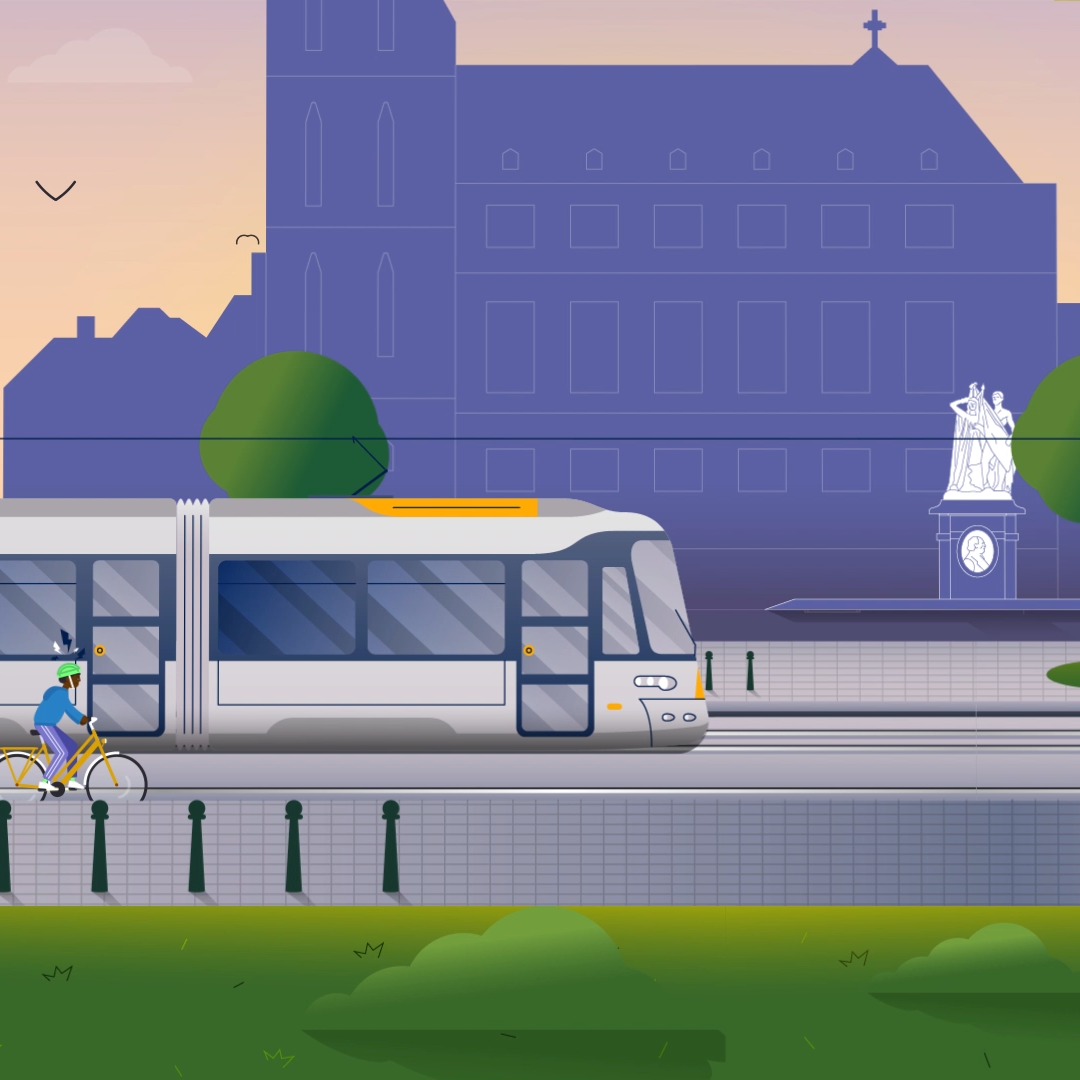
We opted for warm, human, disarming. And so we developed a fixed style that we also continue in other videos we make for Helan.


Relevant cases
Want to chat?


